A new dataset available of geophysical, biotic and climate data. Should be fun to play with in R.
Recology HAS MOVED TO http://recology.info/. To get to the same blog post on the new site replace the http://r-ecology.blogspot.ca/ with http://recology.info/, but with the same ending, e,g. /2011/12/weecology-can-has-new-mammal-dataset.html (except remove the .html at the end)
Friday, March 25, 2011
Wednesday, March 23, 2011
basic ggplot2 network graphs - ver2
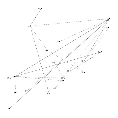
I posted last week a simple function to plot networks using ggplot2 package. Here is version 2. I still need to work on figuring out efficient vertex placement.
Changes in version 2:
-You have one of three options: use an igraph object, a matrix, or a dataframe (matrices will be converted to data frames within the function)
-If you have data on food webs similar to that provided in the Takapoto dataset provided in the NetIndices package, you can set trophic = "TRUE", and gggraph will use the function TrophInd to assign trophic levels (the y axis value) to each vertex/node. You have to provide additional information along with this option such as what the imports and exports are, see NetIndices documentation.
-I added some simple error checking.
-if using method="df" and trophic="FALSE", x axis placement of vertices is now done using the function degreex (see inside the fxn), which sorts vertices according to their degree (so the least connected species are on the left of the graph; note that species with the same degree are not stacked on the y-axis because e.g., two vertices of degree=5 would get x=3 then x=4).
############### Eg
data(Takapoto)
gggraph(Takapoto, vplace = rnorm, method = "df", trophic = "TRUE", trophinames = c(8:10),
import = "CO2", export = c("CO2", "Sedimentation", "Grazing"))
Changes in version 2:
-You have one of three options: use an igraph object, a matrix, or a dataframe (matrices will be converted to data frames within the function)
-If you have data on food webs similar to that provided in the Takapoto dataset provided in the NetIndices package, you can set trophic = "TRUE", and gggraph will use the function TrophInd to assign trophic levels (the y axis value) to each vertex/node. You have to provide additional information along with this option such as what the imports and exports are, see NetIndices documentation.
-I added some simple error checking.
-if using method="df" and trophic="FALSE", x axis placement of vertices is now done using the function degreex (see inside the fxn), which sorts vertices according to their degree (so the least connected species are on the left of the graph; note that species with the same degree are not stacked on the y-axis because e.g., two vertices of degree=5 would get x=3 then x=4).
######### ggraph version 2
require(bipartite)
require(igraph)
require(ggplot2)
require(NetIndices)

# gggraph, version 2
# g = an igraph graph object, a matrix, or data frame
# vplace = type of vertex placement assignment, one of rnorm, runif, etc.
# method = one of 'df' for data frame, "mat' for matrix or "igraph" for an igraph graph object
# trophic = TRUE or FALSE for using Netindices function TrophInd to determine trophic level (y value in graph)
# trophinames = columns in matrix or dataframe to use for calculating trophic level
# import = named or refereced by col# columns of matrix or dataframe to use for import argument of TrophInd
# export = named or refereced by col# columns of matrix or dataframe to use for export argument of TrophInd
# dead = named or refereced by col# columns of matrix or dataframe to use for dead argument of TrophInd

gggraph <- function(g, vplace = rnorm, method, trophic = "FALSE",
     trophinames, import, export)
{
degreex  <- function(x) {
  degreecol <- apply(x, 2, function(y) length(y[y>0]))
  degreerow <- apply(x, 1, function(y) length(y[y>0]))
  degrees <- sort(c(degreecol, degreerow))
  df <- data.frame(degrees, x = seq(1, length(degrees), 1))
  df$value <- rownames(df)
  df
 }
  # require igraph
 if(!require(igraph)) stop("must first install 'igraph' package.")
   # require ggplot2
 if(!require(ggplot2)) stop("must first install 'ggplot2' package.")

if(method=="df"){
  if(class(g)=="matrix"){ g <- as.data.frame(g) }
  if(class(g)!="data.frame") stop("object must be of class 'data.frame.'")
if(trophic=="FALSE"){
 # data preparation from adjacency matrix
 temp <- data.frame(expand.grid(dimnames(g))[1:2], as.vector(as.matrix(g)))
 temp <- temp[(temp[, 3] > 0) & !is.na(temp[, 3]), ]
 temp <- temp[sort.list(temp[, 1]), ]
 g_df <- data.frame(rows = temp[, 1], cols = temp[, 2], freqint = temp[, 3])

 g_df$id <- 1:length(g_df[,1])
 g_df <- data.frame(id=g_df[,4], rows=g_df[,1], cols=g_df[,2], freqint=g_df[,3])
 g_df_ <- melt(g_df, id=c(1,4))

 xy_s <- data.frame(degreex(g), y = rnorm(length(unique(g_df_$value))))
 g_df_2 <- merge(g_df_, xy_s, by = "value")
 } else if(trophic=="TRUE") {
   # require NetIndices
  if(!require(NetIndices)) stop("must first install 'NetIndices' package.")
 # data preparation from adjacency matrix
 temp <- data.frame(expand.grid(dimnames(g[-trophinames, -trophinames]))[1:2],
   as.vector(as.matrix(g[-trophinames, -trophinames])))
 temp <- temp[(temp[, 3] > 0) & !is.na(temp[, 3]), ]
 temp <- temp[sort.list(temp[, 1]), ]
 g_df <- data.frame(rows = temp[, 1], cols = temp[, 2], freqint = temp[, 3])

 g_df$id <- 1:length(g_df[,1])
 g_df <- data.frame(id=g_df[,4], rows=g_df[,1],
      cols=g_df[,2], freqint=g_df[,3])
 g_df_ <- melt(g_df, id=c(1,4))

 xy_s <- data.frame(value = unique(g_df_$value),
  x = rnorm(length(unique(g_df_$value))),
  y = TrophInd(g, Import=import, Export=export)[,1])
 g_df_2 <- merge(g_df_, xy_s, by = "value")
 }
 # plotting
 p <- ggplot(g_df_2, aes(x, y)) +
  geom_point(size = 5) +
  geom_line(aes(size = freqint, group = id)) +
  geom_text(size = 3, hjust = 1.5, aes(label = value)) +
  theme_bw() +
  opts(panel.grid.major=theme_blank(),
   panel.grid.minor=theme_blank(),
   axis.text.x=theme_blank(),
   axis.text.y=theme_blank(),
   axis.title.x=theme_blank(),
   axis.title.y=theme_blank(),
   axis.ticks=theme_blank(),
   panel.border=theme_blank(),
   legend.position="none")

 p # return graph
} else if(method=="igraph") {
  if(class(g)!="igraph") stop("object must be of class 'igraph.'")
 # data preparation from igraph object
 g_ <- get.edgelist(g)
 g_df <- as.data.frame(g_)
 g_df$id <- 1:length(g_df[,1])
 g_df <- melt(g_df, id=3)
 xy_s <- data.frame(value = unique(g_df$value),
  x = vplace(length(unique(g_df$value))),
  y = vplace(length(unique(g_df$value))))
 g_df2 <- merge(g_df, xy_s, by = "value")

 # plotting
 p <- ggplot(g_df2, aes(x, y)) +
  geom_point(size = 2) +
  geom_line(size = 0.3, aes(group = id, linetype = id)) +
  geom_text(size = 3, hjust = 1.5, aes(label = value)) +
  theme_bw() +
  opts(panel.grid.major=theme_blank(),
   panel.grid.minor=theme_blank(),
   axis.text.x=theme_blank(),
   axis.text.y=theme_blank(),
   axis.title.x=theme_blank(),
   axis.title.y=theme_blank(),
   axis.ticks=theme_blank(),
   panel.border=theme_blank(),
   legend.position="none")

 p # return graph
} else
 stop(paste("do not recognize method = \"",method,"\";
  methods are \"df\" and \"igraph\"",sep=""))
}
############### Eg
data(Takapoto)
gggraph(Takapoto, vplace = rnorm, method = "df", trophic = "TRUE", trophinames = c(8:10),
import = "CO2", export = c("CO2", "Sedimentation", "Grazing"))
plants <- round(rlnorm(n=5, meanlog=2, sdlog=1))
animals <- round(rlnorm(n=5, meanlog=2, sdlog=1))
plants <- plants*(100/sum(plants))
animals <- animals*(100/sum(animals))
z <- r2dtable(1,animals,plants)  # if you get errors on this step just rerun again until no error
z <- as.data.frame(z[[1]])
rownames(z) <- c("a","b","c","d","e")
gggraph(z, vplace = rnorm, method = "df", trophic = "FALSE")
g <- grg.game(20, 0.45, torus=FALSE)
gggraph(g, vplace = rnorm, method = "igraph", trophic = "FALSE")
Created by Pretty R at inside-R.org
Thursday, March 17, 2011
basic ggplot2 network graphs
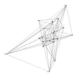
I have been looking around on the web and have not found anything yet related to using ggplot2 for making graphs/networks. I put together a few functions to make very simple graphs. The bipartite function especially is not ideal, as of course we only want to allow connections between unlike nodes, not all nodes. These functions do not, obviously, take full advantage of the power of ggplot2, but it’s a start.
Created by Pretty R at inside-R.org
g <- erdos.renyi.game(20, 5, type="gnm")
# A bipartite graphs
# ggplot network graphics functions
# g = an igraph graph object, any igraph graph object
# vplace = type of vertex placement assignment, one of rnorm, runif, etc.

gggraph <- function(g, vplace = rnorm) {

 require(ggplot2)

 g_ <- get.edgelist(g)
 g_df <- as.data.frame(g_)
 g_df$id <- 1:length(g_df[,1])
 g_df <- melt(g_df, id=3)
 xy_s <- data.frame(value = unique(g_df$value),
  x = vplace(length(unique(g_df$value))),
  y = vplace(length(unique(g_df$value))))
 g_df2 <- merge(g_df, xy_s, by = "value")

 p <- ggplot(g_df2, aes(x, y)) +
  geom_point() +
  geom_line(size = 0.3, aes(group = id, linetype = id)) +
  geom_text(size = 3, hjust = 1.5, aes(label = value)) +
  theme_bw() +
  opts(panel.grid.major=theme_blank(),
   panel.grid.minor=theme_blank(),
   axis.text.x=theme_blank(),
   axis.text.y=theme_blank(),
   axis.title.x=theme_blank(),
   axis.title.y=theme_blank(),
   axis.ticks=theme_blank(),
   panel.border=theme_blank(),
   legend.position="none")

 p

}

ggbigraph <- function(g) {

 require(ggplot2)

 g_ <- get.edgelist(g)
 g_df <- as.data.frame(g_)
 g_df$id <- 1:length(g_df[,1])
 g_df <- melt(g_df, id=3)
 xy_s <- data.frame(value = unique(g_df$value),
  x = c(rep(2, length(unique(g_df$value))/2), rep(4, length(unique(g_df$value))/2)),
  y = rep(seq(1, length(unique(g_df$value))/2, 1), 2))
 g_df2 <- merge(g_df, xy_s, by = "value")

 p <- ggplot(g_df2, aes(x, y)) +
  geom_point() +
  geom_line(size = 0.3, aes(group = id, linetype = id)) +
  geom_text(size = 3, hjust = 1.5, aes(label = value)) +
  theme_bw() +
  opts(panel.grid.major=theme_blank(),
   panel.grid.minor=theme_blank(),
   axis.text.x=theme_blank(),
   axis.text.y=theme_blank(),
   axis.title.x=theme_blank(),
   axis.title.y=theme_blank(),
   axis.ticks=theme_blank(),
   panel.border=theme_blank(),
   legend.position="none")

 p

}
g <- erdos.renyi.game(20, 5, type="gnm")

# A bipartite graphs
g <- grg.game(20, 0.45, torus=FALSE)
ggbigraph(g)
Sunday, March 13, 2011
Species abundance distributions and basketball
A post over at the Phased blog (http://www.nasw.org/users/mslong/) highlights a recent paper in PLoS One by Robert Warren et al. Similar results were obtained in a 2007 Ecology Letters paper by Nekola and Brown, who showed that abundance distributions found in ecology are similar to those found for scientific citations, Eastern North American precipitation, among other things. A similar argument was made by Nee et al. in 1991 (in the journal PRSL-B). The author of the blog appears to agree with the outcome of the Warren et al. study.
I tend to disagree.
In the field of graphs/networks, many networks (social, sexual intercourse among humans, etc.) are found to have similar statistical properties to those of ecological networks (food webs, interactions among mutualists, etc.). However, just because these networks have similar statistical properties does not mean that the statistical properties of ecological networks have no biological meaning.
They make the argument that the common SAD fit may be an artifact of large data sets alone. However, I don't see any explanation of why they think large data sets is a valid explanation of SADs. Surely SAD's are fit to varying sizes of datasets. The problem with small datasets is lack of statistical power to detect a particular pattern, but surely you can get a fit for a particular SAD to a small dataset.
There are ecological mechanistic theories behind different SAD models. They argue that because very similar SADs are found in ecological and non-ecological datasets alike one option is that a universal mechanism structures ecological and non-ecological data (with the mechanism unknown in both). Why can't the same SAD pattern be generated by different mechanisms?
Are Warren et al, Nekola, and Nee right in questioning the utility of SADs? Questioning our theories and ideas only makes the theories better in the end by weeding out shortcomings, etc.

Warren, R., Skelly, D., Schmitz, O., & Bradford, M. (2011). Universal Ecological Patterns in College Basketball Communities PLoS ONE, 6 (3) DOI: 10.1371/journal.pone.0017342
I tend to disagree.
In the field of graphs/networks, many networks (social, sexual intercourse among humans, etc.) are found to have similar statistical properties to those of ecological networks (food webs, interactions among mutualists, etc.). However, just because these networks have similar statistical properties does not mean that the statistical properties of ecological networks have no biological meaning.
They make the argument that the common SAD fit may be an artifact of large data sets alone. However, I don't see any explanation of why they think large data sets is a valid explanation of SADs. Surely SAD's are fit to varying sizes of datasets. The problem with small datasets is lack of statistical power to detect a particular pattern, but surely you can get a fit for a particular SAD to a small dataset.
There are ecological mechanistic theories behind different SAD models. They argue that because very similar SADs are found in ecological and non-ecological datasets alike one option is that a universal mechanism structures ecological and non-ecological data (with the mechanism unknown in both). Why can't the same SAD pattern be generated by different mechanisms?
Are Warren et al, Nekola, and Nee right in questioning the utility of SADs? Questioning our theories and ideas only makes the theories better in the end by weeding out shortcomings, etc.
Warren, R., Skelly, D., Schmitz, O., & Bradford, M. (2011). Universal Ecological Patterns in College Basketball Communities PLoS ONE, 6 (3) DOI: 10.1371/journal.pone.0017342
Friday, March 11, 2011
cloudnumbers.com
UPDATE: I guess it still is not actually available. Bummer...
Has anyone used cloudnumbers.com?
http://www.cloudnumbers.com/
They provide cloud computing, and have built in applications, including R.
How well does it work? Does it increase processing speed? I guess it may at the least free up RAM and processor space on your own machine.
Has anyone used cloudnumbers.com?
http://www.cloudnumbers.com/
They provide cloud computing, and have built in applications, including R.
How well does it work? Does it increase processing speed? I guess it may at the least free up RAM and processor space on your own machine.
Saturday, March 5, 2011
Five ways to visualize your pairwise comparisons
UPDATE: At the bottom are two additional methods, and some additions (underlined) are added to the original 5 methods. Thanks for all the feedback...
-Also, another post here about ordered-categorical data
-Also #2, a method combining splom and hexbin packages here, for larger datasets
In data analysis it is often nice to look at all pairwise combinations of continuous variables in scatterplots. Up until recently, I have used the function splom in the package lattice, but ggplot2 has superior aesthetics, I think anyway.
Here a few ways to accomplish the task:
# load packages
1) Using base graphics, function "pairs"
Created by Pretty R at inside-R.org
2) Using lattice package, function "splom"
-Additional code to improve splom plots here (and see Oscar's code below in comments)
Created by Pretty R at inside-R.org
3) Using package ggplot2, function "plotmatrix"
Created by Pretty R at inside-R.org
4) a function called ggcorplot by Mike Lawrence at Dalhousie University
-get ggcorplot function at this link
-ggcorplot is also built in to Deducer (get here); see Ian's code below in the comments
-Lastly, an improved version of ggcorplot is built in to the ez package (get here)
Created by Pretty R at inside-R.org
5) panel.cor function using pairs, similar to ggcorplot, but using base graphics. Not sure who wrote this function, but here is where I found it.
Created by Pretty R at inside-R.org
A comparison of run times...
Created by Pretty R at inside-R.org
...shows that splom is the fastest method, with the method using the panel.cor function pulling up the rear.
6) given by a reader in the comments (get her/his code here). This one is nice as it gives 95% CI's for the correlation coefficients, AND histograms of each variable.
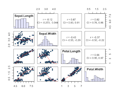
7) a reader in the comments suggested the scatterplotMatrix (spm can be used) function in the car package. This one has the advantage of plotting distributions of each variable, and providing fits to each data with confidence intervals.
-Also, another post here about ordered-categorical data
-Also #2, a method combining splom and hexbin packages here, for larger datasets
In data analysis it is often nice to look at all pairwise combinations of continuous variables in scatterplots. Up until recently, I have used the function splom in the package lattice, but ggplot2 has superior aesthetics, I think anyway.
Here a few ways to accomplish the task:
# load packages
require(lattice)
require(ggplot2)
1) Using base graphics, function "pairs"
Created by Pretty R at inside-R.org
2) Using lattice package, function "splom"
-Additional code to improve splom plots here (and see Oscar's code below in comments)
Created by Pretty R at inside-R.org
3) Using package ggplot2, function "plotmatrix"
plotmatrix(iris[1:4])
4) a function called ggcorplot by Mike Lawrence at Dalhousie University
-get ggcorplot function at this link
-ggcorplot is also built in to Deducer (get here); see Ian's code below in the comments
-Lastly, an improved version of ggcorplot is built in to the ez package (get here)
Created by Pretty R at inside-R.org
5) panel.cor function using pairs, similar to ggcorplot, but using base graphics. Not sure who wrote this function, but here is where I found it.
panel.cor <- function(x, y, digits=2, prefix="", cex.cor)
{
    usr <- par("usr"); on.exit(par(usr))
    par(usr = c(0, 1, 0, 1))
    r <- abs(cor(x, y))
    txt <- format(c(r, 0.123456789), digits=digits)[1]
    txt <- paste(prefix, txt, sep="")
    if(missing(cex.cor)) cex <- 0.8/strwidth(txt)

    test <- cor.test(x,y)
    # borrowed from printCoefmat
    Signif <- symnum(test$p.value, corr = FALSE, na = FALSE,
                  cutpoints = c(0, 0.001, 0.01, 0.05, 0.1, 1),
                  symbols = c("***", "**", "*", ".", " "))

    text(0.5, 0.5, txt, cex = cex * r)
    text(.8, .8, Signif, cex=cex, col=2)
}
pairs(iris[1:4], lower.panel=panel.smooth, upper.panel=panel.cor)
A comparison of run times...
> system.time(pairs(iris[1:4]))
   user  system elapsed
  0.138   0.008   0.156
> system.time(splom(~iris[1:4]))
   user  system elapsed
  0.003   0.000   0.003
> system.time(plotmatrix(iris[1:4]))
   user  system elapsed
  0.052   0.000   0.052
> system.time(ggcorplot(
+ data = iris[1:4],
  var_text_size = 5,
  cor_text_limits = c(5,10)))

   user  system elapsed
  0.130   0.001   0.131
> system.time(pairs(iris[1:4], lower.panel=panel.smooth, upper.panel=panel.cor))
   user  system elapsed
  0.170   0.011   0.200
...shows that splom is the fastest method, with the method using the panel.cor function pulling up the rear.
6) given by a reader in the comments (get her/his code here). This one is nice as it gives 95% CI's for the correlation coefficients, AND histograms of each variable.

7) a reader in the comments suggested the scatterplotMatrix (spm can be used) function in the car package. This one has the advantage of plotting distributions of each variable, and providing fits to each data with confidence intervals.
spm(iris[1:4])
Subscribe to:
Comments (Atom)


