Recology has moved, go to http://recology.info/2011/09/my-take-on-r-introduction-talk
UPDATE: I put in an R tutorial as a Github gist below.
Here is a short intro R talk I gave today...for what it's worth...
Showing posts with label Methods. Show all posts
Showing posts with label Methods. Show all posts
Friday, September 9, 2011

Wednesday, June 22, 2011
iEvoBio 2011 Synopsis
We just wrapped up the 2011 iEvoBio meeting. It was awesome! If you didn't go this year or last year, definitely think about going next year.
Here is a list of the cool projects that were discussed at the meeting (apologies if I left some out):
- Vistrails: workflow tool, awesome project by Claudio Silva
- Commplish: purpose is to use via API's, not with the web UI
- Phylopic: a database of life-form silouhettes, including an API for remote access, sweet!
- Gloome
- MappingLife: awesome geographic/etc data visualization interace on the web
- SuiteSMA: visualizating multiple alignments
- treeBASE: R interface to treebase, by Carl Boettiger
- VertNet: database for vertebrate natural history collections
- RevBayes: revamp of MrBayes, with GUI, etc.
- Phenoscape Knowledge Base
- Peter Midford lightning talk: talked about matching taxonomic and genetic data
- BiSciCol: biological science collections tracker
- Ontogrator
- TNRS: taxonomic name resolution service
- Barcode of Life data systems, and remote access
- Moorea Biocode Project
- Microbial LTER's data
- BirdVis: interactive bird data visualization (Claudio Silva in collaboration with Cornell Lab of Ornithology)
- Crowdlabs: I think the site is down right now, another project by Claudio Silva
- Phycas: Bayesian phylogenetics, can you just call this from R?
- RIP MrBayes!!!! replaced by RevBayes (see 9 above)
- Slides of presentations will be at Slideshare (not all presentations up yet)
- A birds of a feather group I was involved in proposed an idea (TOL-o-matic) like Phylomatic, but of broader scope, for easy access and submission of trees, and perhaps even social (think just pushing a 'SHARE' button within PAUP, RevBayes, or other phylogenetics software)!
- Synopses of Birds of a Feather discussion groups: http://piratepad.net/iEvoBio11-BoF-reportouts
Tuesday, June 7, 2011
How to fit power laws
A new paper out in Ecology by Xiao and colleagues (in press, here) compares the use of log-transformation to non-linear regression for analyzing power-laws.
They suggest that the error distribution should determine which method performs better. When your errors are additive, homoscedastic, and normally distributed, they propose using non-linear regression. When errors are multiplicative, heteroscedastic, and lognormally distributed, they suggest using linear regression on log-transformed data. The assumptions about these two methods are different, so cannot be correct for a single dataset.
They will provide their R code for their methods once they are up on Ecological Archives (they weren't up there by the time of this post).
They suggest that the error distribution should determine which method performs better. When your errors are additive, homoscedastic, and normally distributed, they propose using non-linear regression. When errors are multiplicative, heteroscedastic, and lognormally distributed, they suggest using linear regression on log-transformed data. The assumptions about these two methods are different, so cannot be correct for a single dataset.
They will provide their R code for their methods once they are up on Ecological Archives (they weren't up there by the time of this post).
Wednesday, May 4, 2011
RHIPE package in R for interfacing between Hadoop and R
RHIPE: An Interface Between Hadoop and R
Presented by Saptarshi Guha
Presented by Saptarshi Guha

And this review of methods for interfacing with Hadoop suggests R's RHIPE is quite nice.
Saturday, April 16, 2011
Phylometa from R: Randomization via Tip Shuffle
---UPDATE: I am now using code formatting from gist.github, so I replaced the old prettyR code (sorry guys). The github way is much easier and prettier. I hope readers like the change.
I wrote earlier about some code I wrote for running Phylometa (software to do phylogenetic meta-analysis) from R.
I have been concerned about what exactly is the right penalty for including phylogeny in a meta-analysis. E.g.: AIC is calculated from Q in Phylometa, and Q increases with tree size.
So, I wrote some code to shuffle the tips of your tree N number of times, run Phylometa, and extract just the "Phylogenetic MA" part of the output. So, we compare the observed output (without tip shuffling) to the distribution of the tip shuffled output, and we can calculate a P-value from that. The code I wrote simply extracts the pooled effect size for fixed and also random-effects models. But you could change the code to extract whatever you like for the randomization.
I think the point of this code is not to estimate your pooled effects, etc., but may be an alternative way to compare traditional to phylogenetic MA where hopefully simply incorporating a tree is not penalizing the meta-analysis so much that you will always accept the traditional MA as better.
Get the code here, and also below. Get the example tree file and data file, named "phylogeny.txt" and "metadata_2g.txt", respectively below (or use your own data!). You need the file "phylometa_fxn.r" from my website, get here, but just call it using source as seen below.
As you can see, the observed values fall well within the distribution of values obtained from shuffling tips. P-values were 0.64 and 0.68 for fixed- and random-effects MA's, respectively. This suggests, to me at least, that the traditional (distribution of tip shuffled analyses, the histograms below) and phylogenetic (red lines) MA's are not different. The way I would use this is as an additional analysis to the actual Phylometa output.

I wrote earlier about some code I wrote for running Phylometa (software to do phylogenetic meta-analysis) from R.
I have been concerned about what exactly is the right penalty for including phylogeny in a meta-analysis. E.g.: AIC is calculated from Q in Phylometa, and Q increases with tree size.
So, I wrote some code to shuffle the tips of your tree N number of times, run Phylometa, and extract just the "Phylogenetic MA" part of the output. So, we compare the observed output (without tip shuffling) to the distribution of the tip shuffled output, and we can calculate a P-value from that. The code I wrote simply extracts the pooled effect size for fixed and also random-effects models. But you could change the code to extract whatever you like for the randomization.
I think the point of this code is not to estimate your pooled effects, etc., but may be an alternative way to compare traditional to phylogenetic MA where hopefully simply incorporating a tree is not penalizing the meta-analysis so much that you will always accept the traditional MA as better.
Get the code here, and also below. Get the example tree file and data file, named "phylogeny.txt" and "metadata_2g.txt", respectively below (or use your own data!). You need the file "phylometa_fxn.r" from my website, get here, but just call it using source as seen below.
As you can see, the observed values fall well within the distribution of values obtained from shuffling tips. P-values were 0.64 and 0.68 for fixed- and random-effects MA's, respectively. This suggests, to me at least, that the traditional (distribution of tip shuffled analyses, the histograms below) and phylogenetic (red lines) MA's are not different. The way I would use this is as an additional analysis to the actual Phylometa output.

Sunday, April 10, 2011
Adjust branch lengths with node ages: comparison of two methods
Here is an approach for comparing two methods of adjusting branch lengths on trees: bladj in the program Phylocom and a fxn written by Gene Hunt at the Smithsonian.
Get the code and example files (tree and node ages) here
Get phylocom here: http://www.phylodiversity.net/phylocom/
Gene Hunt's method has many options you can mess with, including setting tip ages (not available in bladj), setting node ages, and minimum branch length imposed. You will notice that Gene's method may be not the appropriate if you only have extant taxa.
The function AdjBrLens uses as input a newick tree file and a text file of node ages, and uses functions you can simply run by "source" the R file bladjing_twomethods.R file from here.
Note that blad does not like numbers for node names, so you have to put a character in front of a number of just character names for nodes.
Created by Pretty R at inside-R.org
It is sort of hard to see the differences in the branch length changes here, but the individual output trees will reveal the differences better.

Get the code and example files (tree and node ages) here
Get phylocom here: http://www.phylodiversity.net/phylocom/
Gene Hunt's method has many options you can mess with, including setting tip ages (not available in bladj), setting node ages, and minimum branch length imposed. You will notice that Gene's method may be not the appropriate if you only have extant taxa.
The function AdjBrLens uses as input a newick tree file and a text file of node ages, and uses functions you can simply run by "source" the R file bladjing_twomethods.R file from here.
Note that blad does not like numbers for node names, so you have to put a character in front of a number of just character names for nodes.
# This is where the work happens...
# Directory below needs to have at least three items:
#  1. phylocom executable for windows or mac
#  2. tree newick file
#  3. node ages file as required by phylocom, see their manual
# Output: trees_out is a list of three trees, the original, bladj, and Gene Hunt's method
# Also, within the function all three trees are written to file as PDFs
setwd("/Mac/R_stuff/Blog_etc/Bladjing") # set working directory
source("bladjing_twomethods.R") # run functions from source file
trees_out <- AdjBrLens("tree.txt", "nodeages.txt")

# plot trees of three methods together,
# with nodes with age estimates labeled
jpeg("threeplots.jpeg", quality=100)
layout(matrix(1:3, 1, 3))
plot(trees_out[[1]])
nodelabels(trees_out[[1]]$node.label, cex = 0.6)
title("original tree")
plot(trees_out[[2]])
nodelabels(trees_out[[2]]$node.label, cex = 0.6)
title("bladj method")
plot(trees_out[[3]])
nodelabels(trees_out[[3]]$node.label, cex = 0.6)
title("gene hunt method, scalePhylo")
dev.off()
It is sort of hard to see the differences in the branch length changes here, but the individual output trees will reveal the differences better.
Friday, March 11, 2011
cloudnumbers.com
UPDATE: I guess it still is not actually available. Bummer...
Has anyone used cloudnumbers.com?
http://www.cloudnumbers.com/
They provide cloud computing, and have built in applications, including R.
How well does it work? Does it increase processing speed? I guess it may at the least free up RAM and processor space on your own machine.
Has anyone used cloudnumbers.com?
http://www.cloudnumbers.com/
They provide cloud computing, and have built in applications, including R.
How well does it work? Does it increase processing speed? I guess it may at the least free up RAM and processor space on your own machine.
Saturday, March 5, 2011
Five ways to visualize your pairwise comparisons
UPDATE: At the bottom are two additional methods, and some additions (underlined) are added to the original 5 methods. Thanks for all the feedback...
-Also, another post here about ordered-categorical data
-Also #2, a method combining splom and hexbin packages here, for larger datasets
In data analysis it is often nice to look at all pairwise combinations of continuous variables in scatterplots. Up until recently, I have used the function splom in the package lattice, but ggplot2 has superior aesthetics, I think anyway.
Here a few ways to accomplish the task:
# load packages
1) Using base graphics, function "pairs"
Created by Pretty R at inside-R.org

2) Using lattice package, function "splom"
-Additional code to improve splom plots here (and see Oscar's code below in comments)
Created by Pretty R at inside-R.org

3) Using package ggplot2, function "plotmatrix"
Created by Pretty R at inside-R.org

4) a function called ggcorplot by Mike Lawrence at Dalhousie University
-get ggcorplot function at this link
-ggcorplot is also built in to Deducer (get here); see Ian's code below in the comments
-Lastly, an improved version of ggcorplot is built in to the ez package (get here)
Created by Pretty R at inside-R.org

5) panel.cor function using pairs, similar to ggcorplot, but using base graphics. Not sure who wrote this function, but here is where I found it.
Created by Pretty R at inside-R.org

A comparison of run times...
Created by Pretty R at inside-R.org
...shows that splom is the fastest method, with the method using the panel.cor function pulling up the rear.
6) given by a reader in the comments (get her/his code here). This one is nice as it gives 95% CI's for the correlation coefficients, AND histograms of each variable.
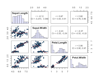
7) a reader in the comments suggested the scatterplotMatrix (spm can be used) function in the car package. This one has the advantage of plotting distributions of each variable, and providing fits to each data with confidence intervals.

-Also, another post here about ordered-categorical data
-Also #2, a method combining splom and hexbin packages here, for larger datasets
In data analysis it is often nice to look at all pairwise combinations of continuous variables in scatterplots. Up until recently, I have used the function splom in the package lattice, but ggplot2 has superior aesthetics, I think anyway.
Here a few ways to accomplish the task:
# load packages
require(lattice)
require(ggplot2)
1) Using base graphics, function "pairs"
Created by Pretty R at inside-R.org

2) Using lattice package, function "splom"
-Additional code to improve splom plots here (and see Oscar's code below in comments)
Created by Pretty R at inside-R.org
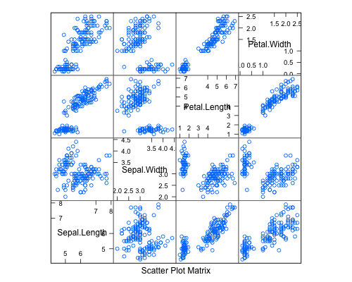
3) Using package ggplot2, function "plotmatrix"
plotmatrix(iris[1:4])

4) a function called ggcorplot by Mike Lawrence at Dalhousie University
-get ggcorplot function at this link
-ggcorplot is also built in to Deducer (get here); see Ian's code below in the comments
-Lastly, an improved version of ggcorplot is built in to the ez package (get here)
Created by Pretty R at inside-R.org

5) panel.cor function using pairs, similar to ggcorplot, but using base graphics. Not sure who wrote this function, but here is where I found it.
panel.cor <- function(x, y, digits=2, prefix="", cex.cor)
{
    usr <- par("usr"); on.exit(par(usr))
    par(usr = c(0, 1, 0, 1))
    r <- abs(cor(x, y))
    txt <- format(c(r, 0.123456789), digits=digits)[1]
    txt <- paste(prefix, txt, sep="")
    if(missing(cex.cor)) cex <- 0.8/strwidth(txt)

    test <- cor.test(x,y)
    # borrowed from printCoefmat
    Signif <- symnum(test$p.value, corr = FALSE, na = FALSE,
                  cutpoints = c(0, 0.001, 0.01, 0.05, 0.1, 1),
                  symbols = c("***", "**", "*", ".", " "))

    text(0.5, 0.5, txt, cex = cex * r)
    text(.8, .8, Signif, cex=cex, col=2)
}
pairs(iris[1:4], lower.panel=panel.smooth, upper.panel=panel.cor)

A comparison of run times...
> system.time(pairs(iris[1:4]))
   user  system elapsed
  0.138   0.008   0.156
> system.time(splom(~iris[1:4]))
   user  system elapsed
  0.003   0.000   0.003
> system.time(plotmatrix(iris[1:4]))
   user  system elapsed
  0.052   0.000   0.052
> system.time(ggcorplot(
+ data = iris[1:4],
  var_text_size = 5,
  cor_text_limits = c(5,10)))

   user  system elapsed
  0.130   0.001   0.131
> system.time(pairs(iris[1:4], lower.panel=panel.smooth, upper.panel=panel.cor))
   user  system elapsed
  0.170   0.011   0.200
...shows that splom is the fastest method, with the method using the panel.cor function pulling up the rear.
6) given by a reader in the comments (get her/his code here). This one is nice as it gives 95% CI's for the correlation coefficients, AND histograms of each variable.

7) a reader in the comments suggested the scatterplotMatrix (spm can be used) function in the car package. This one has the advantage of plotting distributions of each variable, and providing fits to each data with confidence intervals.
spm(iris[1:4])

Thursday, February 24, 2011
Phenotypic selection analysis in R
I have up to recently always done my phenotypic selection analyses in SAS. I finally got some code I think works to do everything SAS would do. Feedback much appreciated!
Created by Pretty R at inside-R.org
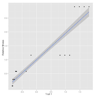
Plot of relative fitness vs. trait 1 standardized
########################Selection analyses#############################
install.packages(c("car","reshape","ggplot2"))
require(car)
require(reshape)
require(ggplot2)

# Create data set
dat <- data.frame(plant = seq(1,100,1),
 trait1 = rep(c(0.1,0.15,0.2,0.21,0.25,0.3,0.5,0.6,0.8,0.9,1,3,4,10,11,12,13,14,15,16), each = 5), trait2 = runif(100),
 fitness = rep(c(1,5,10,20,50), each = 20))

# Make relative fitness column
dat_ <- cbind(dat, dat$fitness/mean(dat$fitness))
names(dat_)[5] <- "relfitness"

# Standardize traits
dat_ <- cbind(dat_[,-c(2:3)], rescaler(dat_[,c(2:3)],"sd"))

####Selection differentials and correlations among traits, cor.prob uses function in functions.R file
############################################################################
####### Function for calculating correlation matrix, corrs below diagonal,
####### and P-values above diagonal
############################################################################
cor.prob <- function(X, dfr = nrow(X) - 2) {
         R <- cor(X)
         above <- row(R) < col(R)
         r2 <- R[above]^2
         Fstat <- r2 * dfr / (1 - r2)
         R[above] <- 1 - pf(Fstat, 1, dfr)
         R
}

# Get selection differentials and correlations among traits in one data frame
dat_seldiffs <- cov(dat_[,c(3:5)]) # calculates sel'n differentials using cov
dat_selcorrs <- cor.prob(dat_[,c(3:5)]) # use P-values above diagonal for significance of sel'n differentials in dat_seldiffs
dat_seldiffs_selcorrs <- data.frame(dat_seldiffs, dat_selcorrs) # combine the two

##########################################################################
####Selection gradients
dat_selngrad <- lm(relfitness ~ trait1 * trait2, data = dat_)
summary(dat_selngrad) # where "Estimate" is our sel'n gradient

####Check assumptions
shapiro.test(dat_selngrad$residuals) # normality, bummer, non-normal
hist(dat_selngrad$residuals) # plot residuals
vif(dat_selngrad) # check variance inflation factors (need package car), everything looks fine
plot(dat_selngrad) # cycle through diagnostic plots

############################################################################
# Plot data
ggplot(dat_, aes(trait1, relfitness)) +
 geom_point() +
 geom_smooth(method = "lm") +
 labs(x="Trait 1",y="Relative fitness")
ggsave("myplot.jpeg")
Plot of relative fitness vs. trait 1 standardized

Subscribe to:
Posts (Atom)