Monday, February 28, 2011

RStudio

New thoughts: After actually using it more, it is quite nice, but I have a couple of major issues.
1. The text editor is quite slow to scroll through.
2. ggplot2 graphics look bad, worse than if just running R alone.

RStudio

Everyone seems to be excited about this...

Is it any good? Seems great for folks just learning R, but perhaps less ideal for advanced R users?

Thursday, February 24, 2011

Phenotypic selection analysis in R

I have up to recently always done my phenotypic selection analyses in SAS. I finally got some code I think works to do everything SAS would do. Feedback much appreciated!


########################Selection analyses#############################
install.packages(c("car","reshape","ggplot2"))
require(car)
require(reshape)
require(ggplot2)
 
# Create data set
dat <- data.frame(plant = seq(1,100,1),
 trait1 = rep(c(0.1,0.15,0.2,0.21,0.25,0.3,0.5,0.6,0.8,0.9,1,3,4,10,11,12,13,14,15,16), each = 5), trait2 = runif(100),
 fitness = rep(c(1,5,10,20,50), each = 20))
 
# Make relative fitness column
dat_ <- cbind(dat, dat$fitness/mean(dat$fitness))
names(dat_)[5] <- "relfitness"
 
# Standardize traits
dat_ <- cbind(dat_[,-c(2:3)], rescaler(dat_[,c(2:3)],"sd"))
 
####Selection differentials and correlations among traits, cor.prob uses function in functions.R file
############################################################################
####### Function for calculating correlation matrix, corrs below diagonal,
####### and P-values above diagonal
############################################################################
cor.prob <- function(X, dfr = nrow(X) - 2) {
         R <- cor(X)
         above <- row(R) < col(R)
         r2 <- R[above]^2
         Fstat <- r2 * dfr / (1 - r2)
         R[above] <- 1 - pf(Fstat, 1, dfr)
         R
} 
 
# Get selection differentials and correlations among traits in one data frame
dat_seldiffs <- cov(dat_[,c(3:5)]) # calculates sel'n differentials using cov
dat_selcorrs <- cor.prob(dat_[,c(3:5)]) # use P-values above diagonal for significance of sel'n differentials in dat_seldiffs
dat_seldiffs_selcorrs <- data.frame(dat_seldiffs, dat_selcorrs) # combine the two
 
##########################################################################
####Selection gradients
dat_selngrad <- lm(relfitness ~ trait1 * trait2, data = dat_)
summary(dat_selngrad) # where "Estimate" is our sel'n gradient
 
####Check assumptions
shapiro.test(dat_selngrad$residuals) # normality, bummer, non-normal
hist(dat_selngrad$residuals) # plot residuals
vif(dat_selngrad) # check variance inflation factors (need package car), everything looks fine
plot(dat_selngrad) # cycle through diagnostic plots
 
############################################################################
# Plot data
ggplot(dat_, aes(trait1, relfitness)) +
 geom_point() +
 geom_smooth(method = "lm") +
 labs(x="Trait 1",y="Relative fitness")
ggsave("myplot.jpeg")
Created by Pretty R at inside-R.org


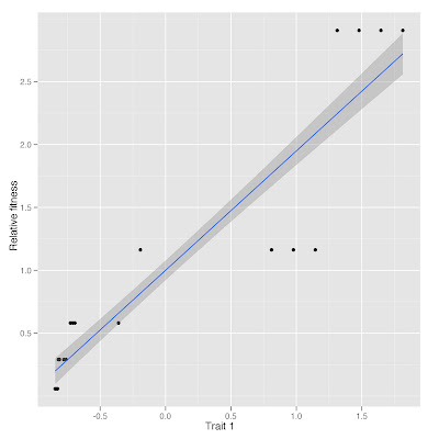
Plot of relative fitness vs. trait 1 standardized

Wednesday, February 16, 2011

Farmer's markets data

I combined USDA data on farmer's markets in the US with population census data to get an idea of the disparity in farmers markets by state, and then also expressed per capita.

Download USDA data here. The formatted file I used below is here (in excel format, although I read into R as csv file). The census data is read from url as below.

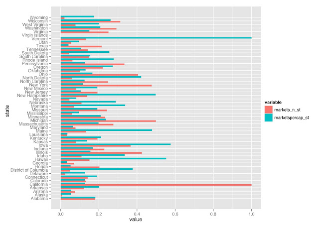
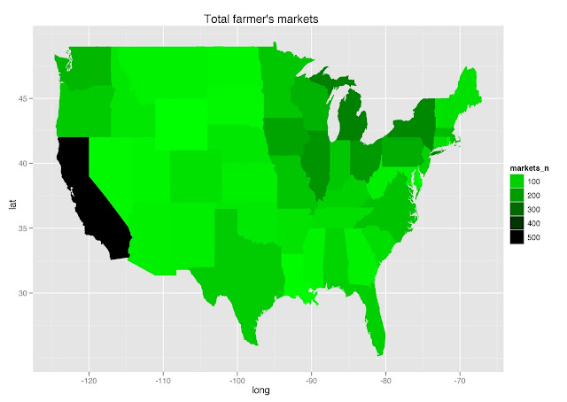
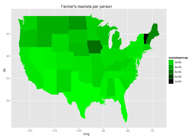
California has a ton of absolute number of farmer's markets, but Vermont takes the cake by far with number of markets per capita. Iowa comes in a distant second behind Vermont in markets per capita.


The code:
######## Farmer's Markets #############
setwd("/Mac/R_stuff/Blog_etc/USDAFarmersMarkets") # Set to your working directory, this is where you want to call files from and write files to
install.packages(c("ggplot2", "RCurl"))  # install all packags required below
require(ggplot2) # plyr is libraried along with ggplot2, as ggplot2 uses plyr (as well as package reshape) functions
 
# read market data
markets <- read.csv("farmmarkets.csv")
markets$state <- as.factor(gsub("Wyoming ", "Wyoming", markets$LocAddState)) # there was a typo for Wyoming
markets <- na.omit(markets)
str(markets)
 
# read population census data
popcen <- read.csv("http://www.census.gov/popest/national/files/NST_EST2009_ALLDATA.csv")
popcen <- popcen[,c(4,5,6,17)]
str(popcen)
 
# summarize
markets_ <- ddply(markets, .(state), summarise,
 markets_n = length(LocAddState) 
)
 
markets_pop_ <- merge(markets_, popcen[,-1], by.x = "state", by.y = "NAME") # merge two data sets
markets_pop_$marketspercap <- markets_pop_$markets_n/markets_pop_$POPESTIMATE2009 # create column of markets per capita
markets_pop_$markets_n_st <- markets_pop_$markets_n/max(markets_pop_$markets_n)
markets_pop_$marketspercap_st <- markets_pop_$marketspercap/max(markets_pop_$marketspercap)
 
# plot
ggplot(melt(markets_pop_[,-c(2:5)]), aes(x = state, y = value, fill = variable)) +
 geom_bar(position = "dodge") +
 coord_flip()
ggsave("fmarkets_barplot.jpeg")
Created by Pretty R at inside-R.org

Note: the x-axis here is standardized value of number of markets (markets_n_st) and number of markets per capita (marketspercap_st).


# maps
try_require("maps")
states <- map_data("state")
markets_pop_$statelow <- tolower(markets_pop_$state)
survey_sum_map <- merge(states, markets_pop_, by.x = "region", by.y = "statelow")
survey_sum_map <- survey_sum_map[order(survey_sum_map$order), ]
str(survey_sum_map)
 
qplot(long, lat, data = survey_sum_map, group = group, fill = markets_n, geom = "polygon", main = "Total farmer's markets") + 
 scale_fill_gradient(low="green", high="black")
ggsave("fmarkets_map_green.jpeg") 


qplot(long, lat, data = survey_sum_map, group = group, fill = marketspercap, geom = "polygon", main = "Farmer's markets per person") +
 scale_fill_gradient(low="green", high="black")
 
ggsave("fmarkerspercap_map_green.jpeg") 


Wednesday, February 9, 2011

Troubling news for the teaching of evolution

[UPDATE: i remade the maps in green, hope that helps...]

A recent survey reported in Science ("Defeating Creationism in the Courtroom, but not in the Classroom") found that biology teachers in high school do not often accept the basis of their discipline, as do teachers in other disciplines, and thus may not teach evolution appropriately. Read more here: New York Times.

I took a little time to play with the data provided online along with the Science article. The data is available on the Science website along with the article, and the dataset I read into R is unchanged from the original. The states abbreviations file is here (as a .xls). Here goes:

I only played with two survey questions: q1b (no. of hours ecology is taught per year), and q1d (no. of hours evolution is taught per year). I looked at ecology and evolution as this blog is about ecology and evolution. It seems that some states that teach a lot of ecology teach a lot of evolution, but I found no correlation between the two without extreme outliers. I couldn’t help but notice my home state, TX, is near the bottom of the list on both counts - go TX! The teaching of evolution on the map produced below is less predictable than I would have though just based on my assumptions about political will in each state.


# Analyses of Conditionality Data set of all variables, except for latitude, etc.
setwd("/Mac/R_stuff/Blog_etc/EvolutionTeaching/") # Set working directory
library(ggplot2)
 
# read in data, and prepare new columns
survey <- read.csv("berkmandata.csv")
str(survey) # (I do realize that survey is a data object in the MASS package)
 
# Assign actual hours to survey answers 
ecol <- gsub(1, 0, survey$q1b)
ecol <- gsub(2, 1.5, ecol)
ecol <- gsub(3, 4, ecol)
ecol <- gsub(4, 8, ecol)
ecol <- gsub(5, 13, ecol)
ecol <- gsub(6, 18, ecol)
ecol <- gsub(7, 20, ecol)
 
evol <- gsub(1, 0, survey$q1d)
evol <- gsub(2, 1.5, evol)
evol <- gsub(3, 4, evol)
evol <- gsub(4, 8, evol)
evol <- gsub(5, 13, evol)
evol <- gsub(6, 18, evol)
evol <- gsub(7, 20, evol)
 
survey$ecol <- as.numeric(ecol)
survey$evol <- as.numeric(evol)
 
# ddply it
survey_sum <- ddply(survey, .(st_posta), summarise,
 mean_ecol_hrs = mean(ecol, na.rm=T),
 mean_evol_hrs = mean(evol, na.rm=T),
 se_ecol_hrs = sd(ecol, na.rm=T)/sqrt(length(ecol)),
 se_evol_hrs = sd(evol, na.rm=T)/sqrt(length(evol)),
 num_teachers = length(st_posta)
)
 
# plotting
limits_ecol <- aes(ymax = mean_ecol_hrs + se_ecol_hrs, ymin = mean_ecol_hrs - se_ecol_hrs)
limits_evol <- aes(ymax = mean_evol_hrs + se_evol_hrs, ymin = mean_evol_hrs - se_evol_hrs)
 
ggplot(survey_sum, aes(x = reorder(st_posta, mean_ecol_hrs), y = mean_ecol_hrs)) +
 geom_point() +
 geom_errorbar(limits_ecol) +
 geom_text(aes(label = num_teachers), vjust = 1, hjust = -3, size = 3) +
 coord_flip() +
 labs(x = "State", y = "Mean hours of ecology taught \n per year (+/- 1 se)")
####SMALL NUMBERS BY BARS ARE NUMBER OF TEACHERS THAT RESPONDED TO THE SURVEY

 
ggplot(survey_sum, aes(x = reorder(st_posta, mean_evol_hrs), y = mean_evol_hrs)) +
 geom_point() +
 geom_errorbar(limits_evol) +
 geom_text(aes(label = num_teachers), vjust = 1, hjust = -3, size = 3) +
 coord_flip() +
 labs(x = "State", y = "Mean hours of evolution taught \n per year (+/- 1 se)")
 ####SMALL NUMBERS BY BARS ARE NUMBER OF TEACHERS THAT RESPONDED TO THE SURVEY


# map
try_require("maps")
states <- map_data("state")
statenames <- read.csv("/Mac/R_stuff/Code/states_abbreviations.csv")
survey_sum_ <- merge(survey_sum, statenames, by.x = "st_posta", by.y = "state_abbrev")
survey_sum_map <- merge(states, survey_sum_, by.x = "region", by.y = "state")
survey_sum_map <- survey_sum_map[order(survey_sum_map$order), ]
 
qplot(long, lat, data = survey_sum_map, group = group, fill = mean_ecol_hrs, geom = "polygon") + scale_fill_gradient(low="black", high="green")


qplot(long, lat, data = survey_sum_map, group = group, fill = mean_evol_hrs, geom = "polygon") + scale_fill_gradient(low="black", high="green")


Created by Pretty R at inside-R.org

Tuesday, February 1, 2011

Plants are less sex deprived when next to closely related neighbors

A new early online paper in American Journal of Botany by Risa Sargent and colleagues suggests that plants are less sex deprived (pollen limited) in vernal pools that have more closely related plant species.

Vernal pools are (at least in my experience) small (to quite large) depressions that fill up with water with winter rains, and dry out completely in the summer. Vernal pool adapted plants flower in rings down the pool as the water dries up. Aquatic invertebrates and some herps can last through the summer by burrowing in the soil.

The study did hand pollination experiments with a focal species, Lasthenia fremontii. They examined the relationship between these pollen limitation experiments and the relatedness of L. fremontii to the rest of the plant community in each pool.

Plant species richness was not related to pollen limitation. Thus, at least in their study with vernal pools in California, relatedness to your plant neighbors has a greater impact than plant richness.

The great thing about vernal pools is that they are truly terrestrial islands of habitat, surrounded by inhospitable habitat for pool species. Many vernal pools are created artificially for habitat conservation easements (e.g., here). Perhaps someone can experimentally manipulate phylogenetic diversity in artificially created pools to really get at the causal links.


p.s. Ok, this post is not terribly R related, except for that this paper used R for some of their statistics.