-Also, another post here about ordered-categorical data
-Also #2, a method combining splom and hexbin packages here, for larger datasets
In data analysis it is often nice to look at all pairwise combinations of continuous variables in scatterplots. Up until recently, I have used the function splom in the package lattice, but ggplot2 has superior aesthetics, I think anyway.
Here a few ways to accomplish the task:
# load packages
require(lattice)
require(ggplot2)
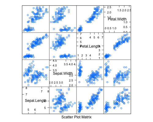
1) Using base graphics, function "pairs"
Created by Pretty R at inside-R.org

2) Using lattice package, function "splom"
-Additional code to improve splom plots here (and see Oscar's code below in comments)
Created by Pretty R at inside-R.org
3) Using package ggplot2, function "plotmatrix"
plotmatrix(iris[1:4])

4) a function called ggcorplot by Mike Lawrence at Dalhousie University
-get ggcorplot function at this link
-ggcorplot is also built in to Deducer (get here); see Ian's code below in the comments
-Lastly, an improved version of ggcorplot is built in to the ez package (get here)
Created by Pretty R at inside-R.org

5) panel.cor function using pairs, similar to ggcorplot, but using base graphics. Not sure who wrote this function, but here is where I found it.
panel.cor <- function(x, y, digits=2, prefix="", cex.cor)
{
    usr <- par("usr"); on.exit(par(usr))
    par(usr = c(0, 1, 0, 1))
    r <- abs(cor(x, y))
    txt <- format(c(r, 0.123456789), digits=digits)[1]
    txt <- paste(prefix, txt, sep="")
    if(missing(cex.cor)) cex <- 0.8/strwidth(txt)

    test <- cor.test(x,y)
    # borrowed from printCoefmat
    Signif <- symnum(test$p.value, corr = FALSE, na = FALSE,
                  cutpoints = c(0, 0.001, 0.01, 0.05, 0.1, 1),
                  symbols = c("***", "**", "*", ".", " "))

    text(0.5, 0.5, txt, cex = cex * r)
    text(.8, .8, Signif, cex=cex, col=2)
}
pairs(iris[1:4], lower.panel=panel.smooth, upper.panel=panel.cor)

A comparison of run times...
> system.time(pairs(iris[1:4]))
   user  system elapsed
  0.138   0.008   0.156
> system.time(splom(~iris[1:4]))
   user  system elapsed
  0.003   0.000   0.003
> system.time(plotmatrix(iris[1:4]))
   user  system elapsed
  0.052   0.000   0.052
> system.time(ggcorplot(
+ data = iris[1:4],
  var_text_size = 5,
  cor_text_limits = c(5,10)))

   user  system elapsed
  0.130   0.001   0.131
> system.time(pairs(iris[1:4], lower.panel=panel.smooth, upper.panel=panel.cor))
   user  system elapsed
  0.170   0.011   0.200
...shows that splom is the fastest method, with the method using the panel.cor function pulling up the rear.
6) given by a reader in the comments (get her/his code here). This one is nice as it gives 95% CI's for the correlation coefficients, AND histograms of each variable.

7) a reader in the comments suggested the scatterplotMatrix (spm can be used) function in the car package. This one has the advantage of plotting distributions of each variable, and providing fits to each data with confidence intervals.
spm(iris[1:4])

ggcorplot is also incorperated into Deducer
ReplyDeletelibrary(Deducer)
corr.mat<-cor.matrix(variables=d(Sepal.Length,Sepal.Width,Petal.Length,Petal.Width),,
data=iris,
test=cor.test,
method='pearson',
alternative="two.sided")
print(corr.mat)
ggcorplot(cor.mat=corr.mat,data=iris,
cor_text_limits=c(5,20),
line.method="lm")
dev.new()
plot(cor.mat)
dev.new()
qscatter_array(d(Sepal.Length,Sepal.Width,Petal.Length,Petal.Width),
d(Sepal.Length,Sepal.Width,Petal.Length,Petal.Width),
data=iris) + geom_smooth(method="lm")
Actually Mike Lawrence has created an improved version of the plot that is rolled into his ez package (http://cran.r-project.org/web/packages/ez/index.html)
ReplyDeleteThe function is called ezCor
@Ian: Thanks for pointing that out! I don't use Deducer, but good to know it is in there.
ReplyDelete@Adam: Thanks for pointing out the ez package - I hadn't seen it...
ReplyDeleteHi,
ReplyDeleteYou can use some additional code to improve the splom plot:
##From http://www.mail-archive.com/r-help@stat.math.ethz.ch/msg94527.html
panel.density.splom <- function(x, ...){
yrng <- current.panel.limits()$ylim
d <- density(x)
d$y <- with(d, yrng[1] + 0.95 * diff(yrng) * y / max(y) )
panel.lines(d, col='black')
diag.panel.splom(x, ...)
}
splom(~iris[1:4],
par.settings=custom.theme.2(pch=19, cex=0.8, alpha=0.5),
diag.panel = panel.density.splom,
lower.panel = function(x, y, ...){
panel.xyplot(x, y, ..., col = 'lightblue')
panel.loess(x, y, ..., col = 'red')
}
)
Thanks for this post using ggplot2. I like displaying 95% confidence intervals for r values, as seen here using the same data:
ReplyDeletehttp://handlesman.blogspot.com/2011/03/matrix-plot-with-confidence-intervals.html
Nice overview, thanks. Just to add, you could also try scatterplot.matrix in the car package (based on pairs, but offering more options)
ReplyDeleteThanks for the tips. On statistical grounds, I don't recommend putting smoothers on the scatter plots by default, so I like the first two plots the best. Adding a smoother makes people think that there is an explanatory variable and a response variable, when in fact the graph might be displaying a pair of explantory variables or a pair of responses. Without the smoothers, it is easier to see statistical measures such as clustering, bivariate density, and so forth.
ReplyDelete@Oscar: Oscar, I couldn't get your code to work to improve the splom plot. What exactly is custom.theme.2?
ReplyDelete@pvanb: Nice addition. Good to know you can use car for this kind of data exploration.
ReplyDelete@Rick: I agree that the smoothers can be misleading. But if these methods are purely for data exploration prior to and during analysis it seems okay, I think at least. I tend to favor ggplot2 graphics, so I hope plotmatrix continues to be developed. plotmatrix is somewhat slow however.
ReplyDeleteThanks and I have a super offer you: Where To Loan For House Renovation house renovation pictures
ReplyDelete